Today I came across a most excellent visualization of our changing climate. Ed Hawkins, professor of meteorology at the University of Reading, put it together. The animation below shows the change in temperature above pre-industrial (1850) levels. Every frame is one year.
Spiralling global temperatures from 1850-2016 (full animation) https://t.co/YETC5HkmTr pic.twitter.com/Ypci717AHq
— Ed Hawkins (@ed_hawkins) May 9, 2016
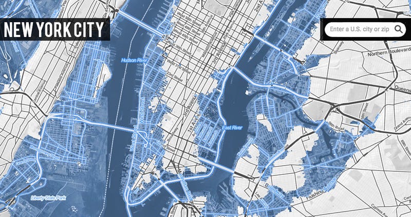
Scary looking, no? Notice how much faster the temperature is increasing as time goes on? We can expect even more increases. We are remarkably close to 1.5 degrees above pre-industrial levels. At 2 degrees, large parts of Manhattan will flood:
No comments:
Post a Comment